

How to Make Your Labels Pop on Instagram, TikTok and Online Stores
From the Product to the Screen
Your product label might look fantastic in your hand, but how does it look on a phone screen?
For many brands, that’s becoming just as important. Customers are discovering products through Instagram, watching them being unpacked on TikTok and comparing them side-by-side in online stores. Your label might only have a second or two to grab their attention.
That doesn’t mean completely rethinking your packaging for social media. It means making smart product label design choices that work just as well on screen as they do in real life.
1. Design for the Scroll
Think about how quickly you move through Facebook, Instagram or TikTok. Probably pretty fast.
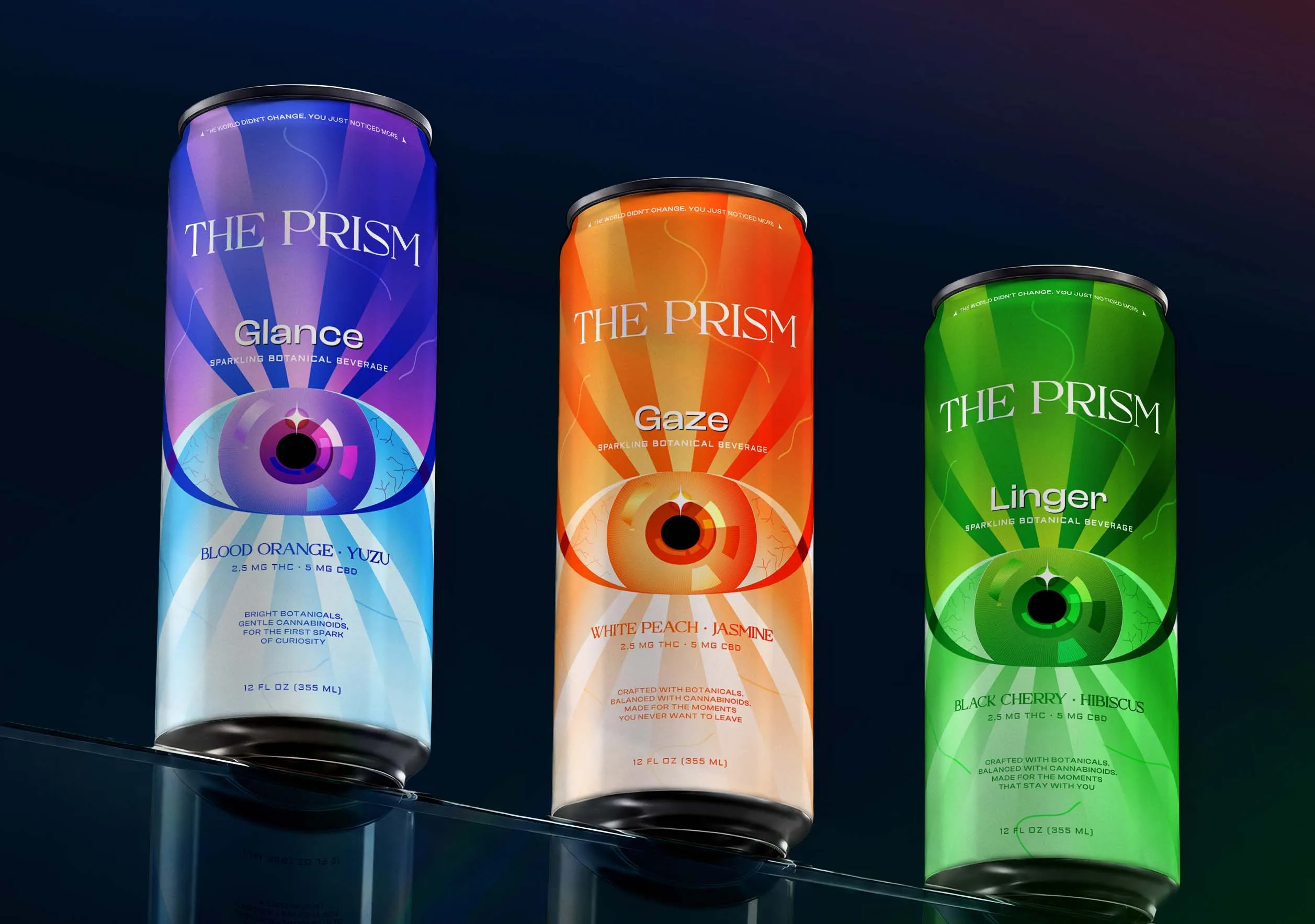
Strong colour, contrast and distinctive branding can help your product register before someone scrolls past. The trick is knowing what you want people to notice first.
It might be your logo, product name, flavour, fragrance or one distinctive graphic element. Whatever it is, give it enough space and prominence to do its job.
The best label designs don’t necessarily shout the loudest. They simply make it easy to understand what you’re looking at.
SOURCE: Packaging Of The World
2. Check Your Label at Phone Size
Small details can look beautiful on a large artwork file and almost disappear when viewed on a phone.
Fine typography, delicate illustrations and subtle colour differences can all lose impact once your product becomes a thumbnail in an online store or appears briefly in a Reel.
There’s an easy test. Take a photo of your finished product and shrink it down on your screen. Can you still recognise the brand? Can you tell what the product is?
This is particularly useful during label creation, when there is still time to simplify an element, increase contrast or make important information more prominent.
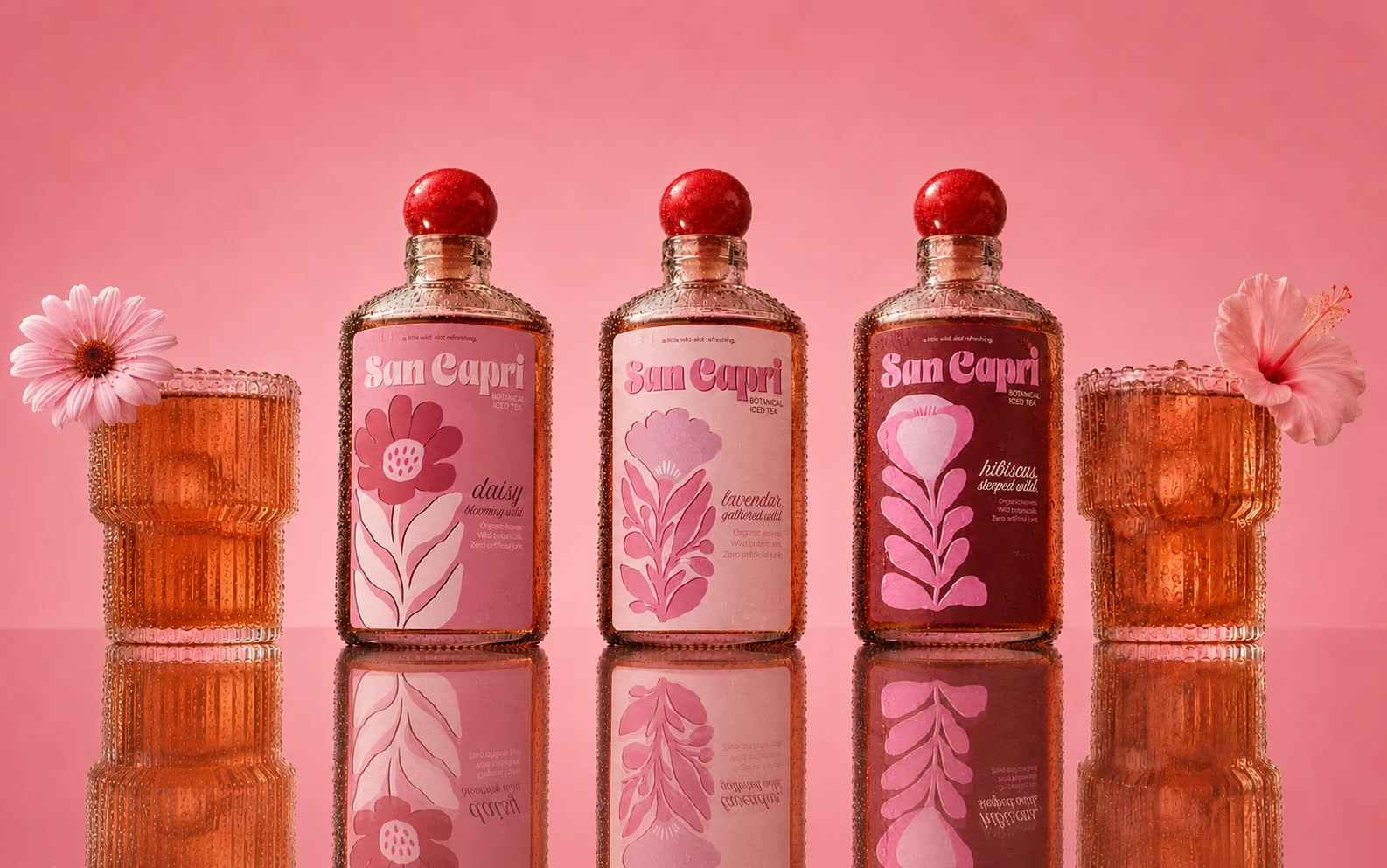
It doesn’t mean everything needs to be big and bold. Minimalist packaging can perform beautifully online too. It just needs a clear focal point.
SOURCE: World Brand Design Society
3. Think About How Your Label Photographs
The material and finish you choose can change the way a label behaves in front of a camera.
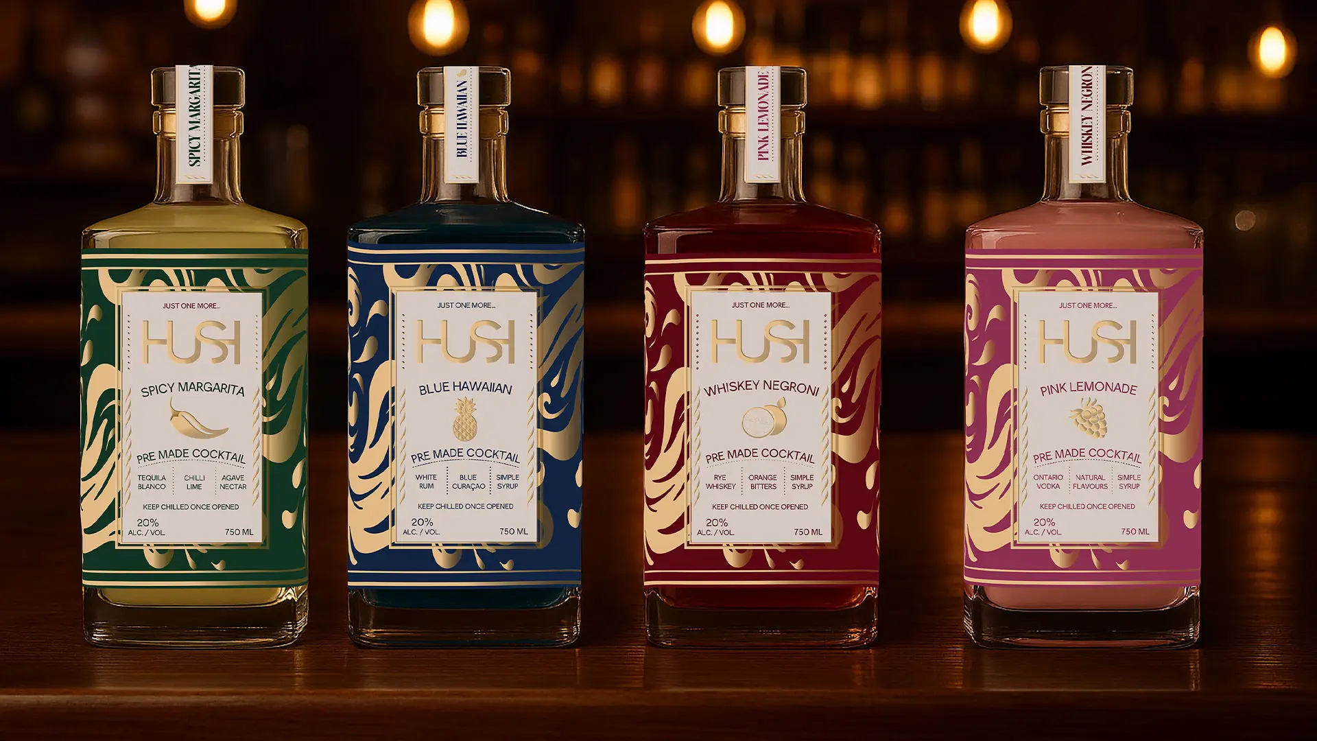
A matt finish can create a softer, understated appearance and help reduce reflections. Gloss can make colours appear vibrant and give packaging a polished look. Textured stocks can bring a tactile quality to close-up photography, while metallic materials can catch changing light as the product moves.
That last point is especially interesting for TikTok and Reels. A metallic detail that is subtle in a still image can suddenly become much more noticeable when the bottle, jar or package is turned in someone’s hand.
For businesses looking to design stickers or labels specifically for highly visual products, it’s worth thinking about the finish as part of the overall look, not simply something added after the artwork is complete.
SOURCE: World Brand Design Society
4. Use Video to Show What a Photo Can't
Some labels are made for movement.
Metallic effects, gloss finishes and textured materials can reveal themselves differently as the angle and lighting change. A short video can therefore communicate details that are difficult to capture in a single product photograph.
Wine and beverage brands are a great example. When considering custom wine label printing, think about how details such as textured stocks, metallic elements or contrasting finishes might appear as the bottle is picked up, poured or turned towards the camera.
The same thinking can apply to beer label design, particularly when cans and bottles are being photographed cold, held outdoors or featured in fast-moving social content.
You’re not just designing something to sit on a shelf. You’re designing something people may interact with on camera.
SOURCE: The Dieline
5. Make the Unboxing Worth Sharing
TikTok and Instagram have turned opening a parcel into content.
For smaller brands in particular, that creates an opportunity. Your shipping box may be fairly simple, but the moment it opens can reveal branded stickers, product labels, seals or other small touches that make the order feel more considered.
Think about what your customer sees first and what they might naturally want to photograph or film.
This doesn’t require elaborate packaging. A well-designed label or sticker can be enough to make a plain box, tissue wrap, bottle or jar feel unmistakably yours.
And if customers do share it, your branding is already part of the content.
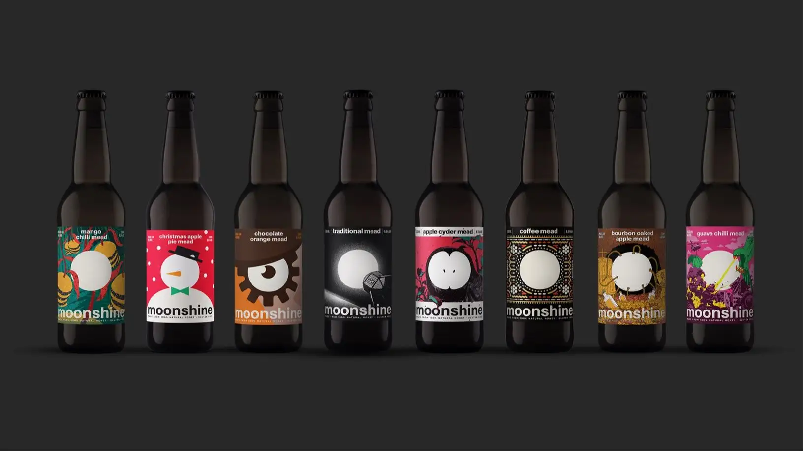
SOURCE: The Dieline
6. Make Your Range Look Like a Range
Scroll through an online store containing six products from the same brand. Do they immediately look like they belong together?
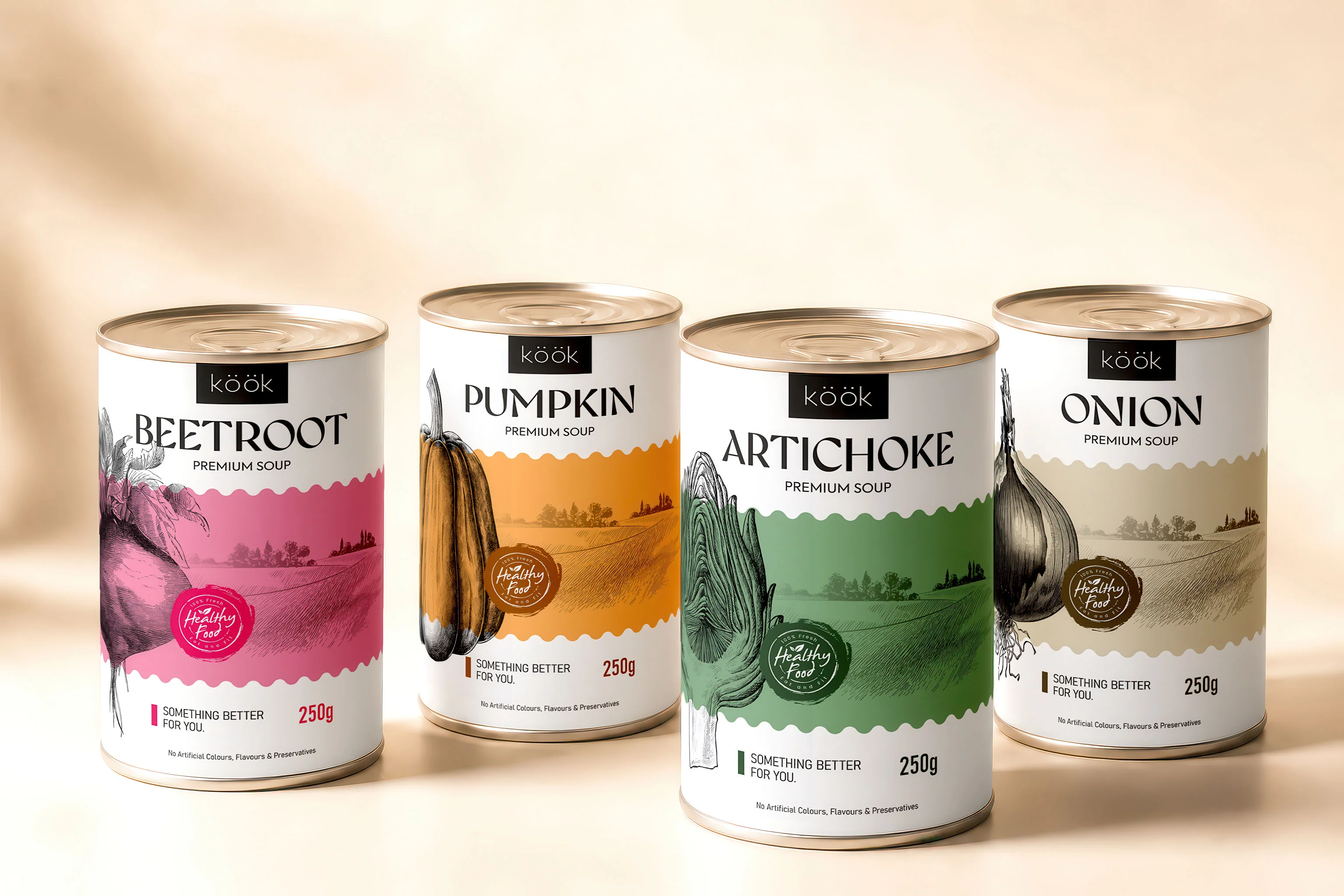
Consistency becomes particularly powerful online because customers often see an entire range at once. Keeping elements such as logo position, typography, label shape or overall design style consistent can create a much stronger visual presence.
You can still use colour, illustrations or other details to distinguish individual products. In fact, variation within a consistent system can make an online range particularly satisfying to browse.
This is where thoughtful product label design goes beyond making one product look good. It helps build recognition across the entire brand.
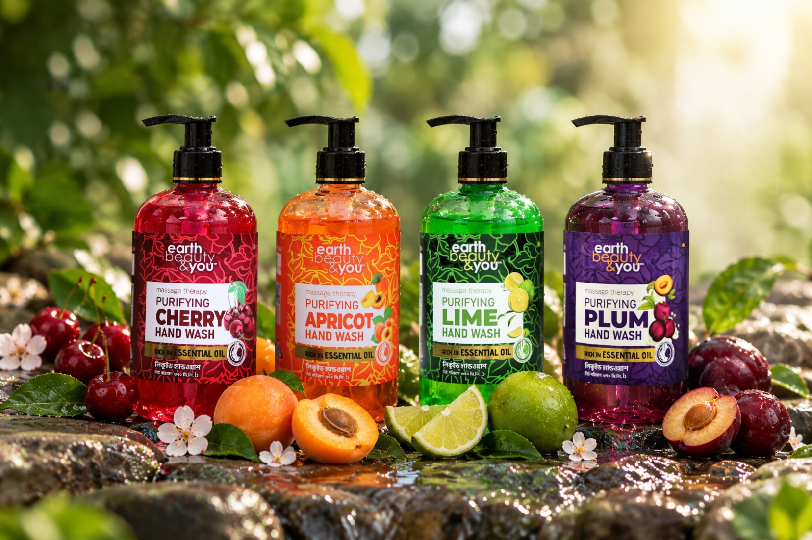
SOURCE: Packaging Of The World
Before You Hit Print, Look at Your Label on Screen
A great label still needs to work on the actual product. It needs the right material, adhesive and finish for the conditions it will face.
But it’s also worth adding one more question before approving your next design: How will this look online?
View the artwork small. Photograph a sample. Try it under different lighting. Film the product moving. Put several products next to each other and see whether the range feels connected.
Whether you're refining a beer label design, exploring custom wine label printing or creating labels for cosmetics, candles, food or almost anything else, a few simple checks can help make sure your packaging is ready for both the real world and the screen.
At LabEX, you can explore different label materials, finishes and options to find a combination that works for your product, your brand and, increasingly, your camera roll.