

Top 6 Label Designs from Around the World - July & August 2026 Edition
Standing Out Starts with Knowing Who You Are
Great packaging doesn't always need to shout for attention. Sometimes the strongest label designs stand out because they know exactly what to simplify, emphasise or change.
From colourful wine labels and character-led honey packaging to bold dips, spices and personal care, this July & August collection shows how brands are using colour, typography and illustration to build recognition and personality. Each offers practical inspiration you can bring to your own label creation project.
Let's take a closer look at six designs making an impact.
1. Evolving a Brand Without Losing Recognition - Novak Winery
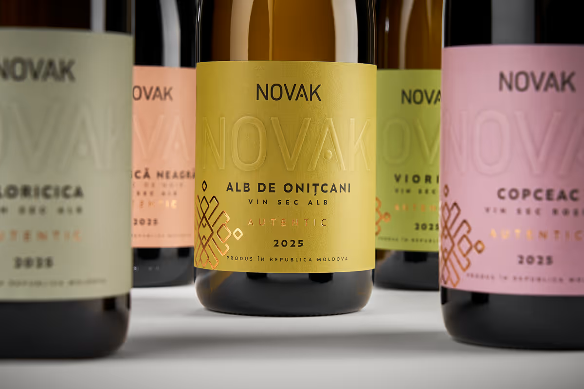
Refreshing an established brand can be tricky. Change too little and the packaging risks feeling dated. Change too much and you can lose the recognition you've spent years building. Novak Winery strikes a smart balance, evolving its existing identity while giving the range a more contemporary feel.
Colour plays an important role, with different combinations helping distinguish wines across the range while maintaining a consistent visual language. The result shows how custom wine label printing can support a brand refresh without requiring you to abandon the elements customers already recognise.
Get the Look
Keep your strongest brand elements consistent, then use colour to differentiate products across your range. This creates variety without making each label feel disconnected.
Premium Wine Labels can work well to achieve textured, but still clean and contemporary wine packaging. The uncoated paper elevating the overall look and feel of the label.
SOURCE: World Brand Society
2. Giving an Overlooked Category New Energy - Yaza Dips
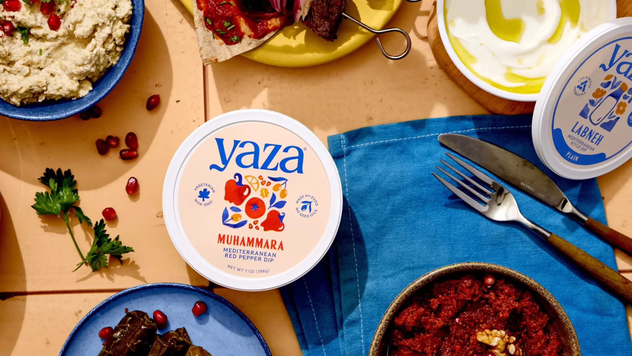
Yaza brings a bold identity to baba ganoush and muhammara, two products that can easily be overshadowed by hummus on the shelf. A large, flowing wordmark dominates the packaging, while simple ingredient illustrations and restrained colour coding help customers distinguish between varieties.
Rather than following familiar category conventions, the design gives these dips a visual language of their own. It's a useful reminder that strong product label design can help less familiar products feel approachable while still giving them enough personality to earn attention.
Get the Look
Let one strong element lead the design, whether that's your wordmark, typography or illustration. Then use a limited colour system to differentiate varieties without making the range feel disconnected.
Polypropylene is a practical choice for refrigerated products where labels may encounter moisture or condensation. A matt laminate can soften the overall appearance while providing additional protection.
SOURCE: The Dieline
3. Turning a Familiar Product into a Character - Hummey Honey
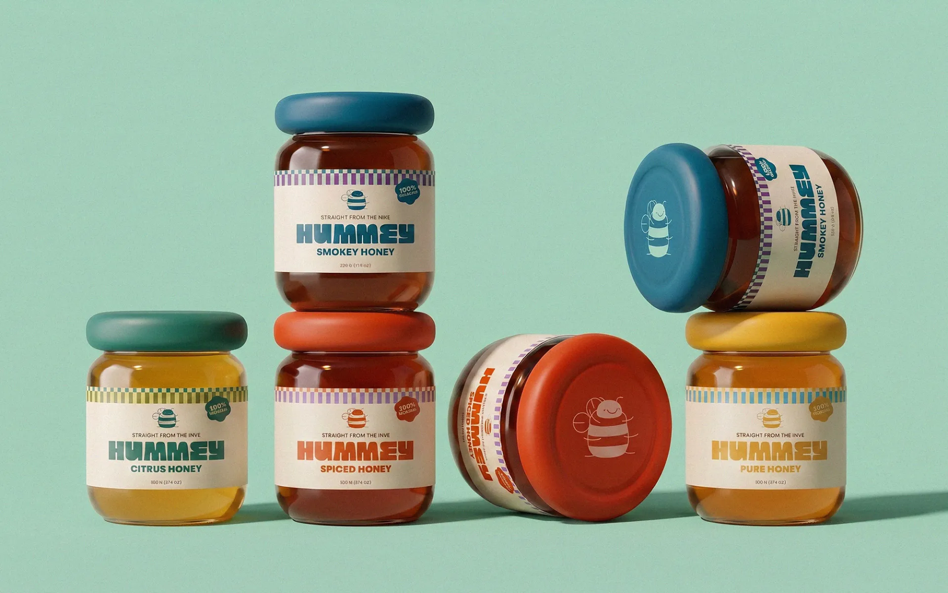
Hummey gives honey packaging a playful personality by building its identity around a bumble bee-inspired mascot. Rounded forms, bold stripes and warm colours work together with the character, creating packaging that feels friendly and instantly recognisable rather than overly traditional.
The strength of the concept is its consistency. The mascot isn't simply an illustration added to the label. It forms part of a wider visual system that carries across the packaging, helping different products feel connected while still leaving room for individual flavour cues.
Get the Look
Choose one distinctive visual element, such as a character, pattern or illustration style, and carry it consistently across your range. Supporting colours can then help distinguish individual varieties.
Paper Labels are well suited to colourful illustrations and detailed graphics. A matt laminate can provide extra protection while giving the finished label a softer, more understated appearance.
SOURCE: Packaging Of The World
4. Colour That Brings a Range Together - San Capri
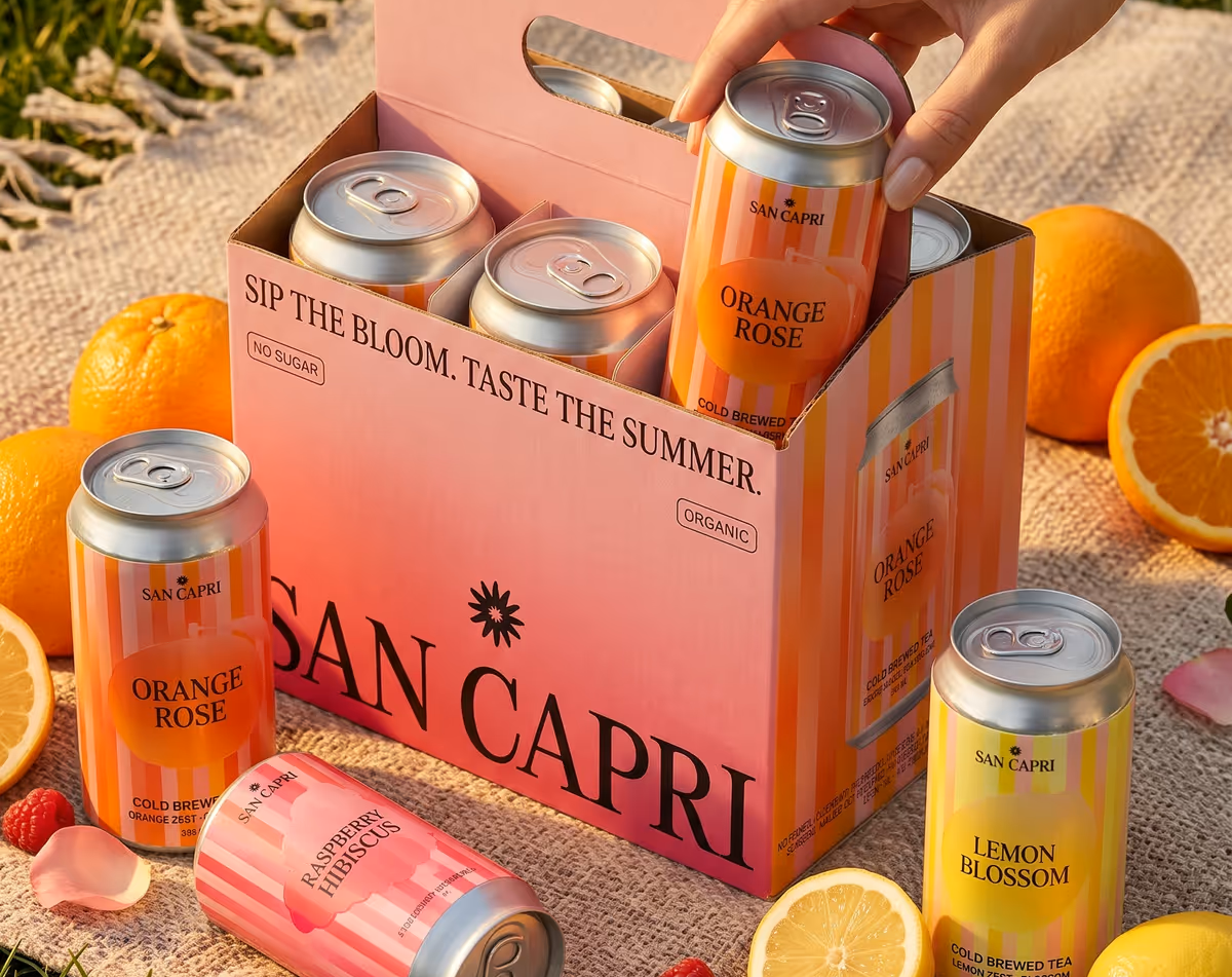
San Capri uses colour to give each botanical cold brew tea its own personality while keeping the wider range connected. Gradients and vertical stripes create an energetic backdrop, while simplified fruit forms and contrasting typography help communicate each flavour clearly.
What works particularly well is the balance between variation and consistency. Each flavour has its own palette, but the recurring visual elements make every product unmistakably part of the same family. It's a useful approach when you want customers to quickly tell products apart without weakening your overall brand identity.
Get the Look
Build a consistent layout first, then use colour to distinguish individual flavours or varieties. Repeating key graphic elements across every label will help the range stay visually connected.
Synthetic Polypropylene is a practical choice for chilled beverages where moisture and condensation may be a consideration. A gloss laminate can enhance vibrant colours while providing additional protection.
SOURCE: World Brand Design Society
5. Packaging That Helps Customers Explore - Aara Spices
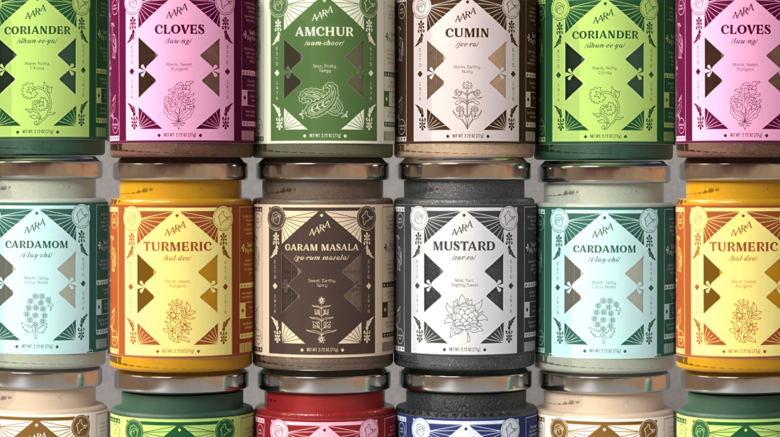
Aara takes a thoughtful approach to spice packaging by helping customers understand what they are buying, not simply recognise it on the shelf. Rather than leaning heavily on familiar Indian heritage cues, the labels bring useful information forward, including pronunciation, origin stories, flavour profiles, nutrition and recipe inspiration.
This makes the packaging feel like an invitation to explore. By combining clear information with a contemporary identity, Aara shows how good product label design can make unfamiliar ingredients feel more approachable while giving customers useful reasons to pick up the product and learn more.
Get the Look
Think about what customers genuinely need to know before choosing your product, then create a clear hierarchy so that information is easy to navigate. Avoid filling every available space simply because you can.
Paper Labels provide a versatile surface for detailed typography, colour and information-led design stickers. A matt laminate can add protection while keeping the overall finish clean and understated.
SOURCE: Packaging Of The World
6. Fresh Colour with a Clear Purpose - Flora Shampoo
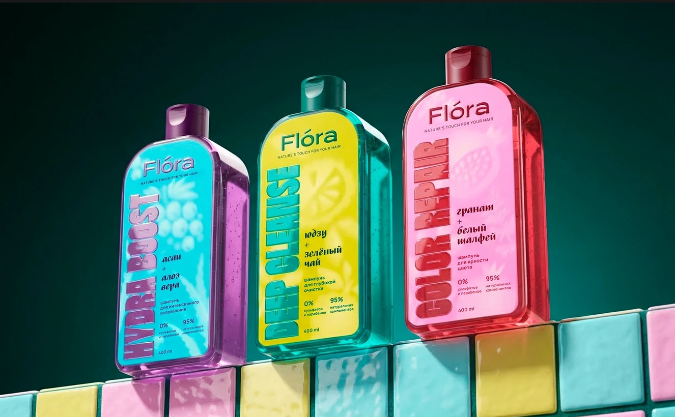
Flora uses vibrant colour and rhythmic graphics to bring energy to its shampoo range. Each product has its own visual character, while the consistent design system keeps the collection recognisable as a whole. The bright palette reinforces the brand's focus on freshness and natural care without making the packaging feel overly complicated.
The approach shows that bold packaging doesn't need dozens of competing elements. A clear visual system, repeated consistently across the range, can give each product enough individuality while maintaining strong brand recognition on the shelf.
Get the Look
Use colour to help customers distinguish between different products or functions, but keep your typography and core graphic elements consistent so the range still feels connected.
Polypropylene is a practical choice for bathroom products where labels are likely to encounter water and moisture. A matt or gloss laminate can provide additional protection while letting you choose between a softer or more vibrant finish.
SOURCE: Behance
What Makes a Label Worth Remembering?
These six examples take very different approaches, but they share one thing: every design has a clear purpose. Whether it's helping customers navigate a range, introducing an unfamiliar product or giving an established brand new energy, the strongest label designs make deliberate choices rather than adding detail for the sake of it.
That same thinking can guide your own packaging. Whether you're working on food labels, beer label design or your next label creation project, start with what customers need to notice, understand or remember. Then let your typography, colour, imagery and materials support that idea.
If you're ready to turn those ideas into finished labels, LabEX can help you choose the right label stock and finish to complement your design and bring your packaging to life.